

Personal Projects
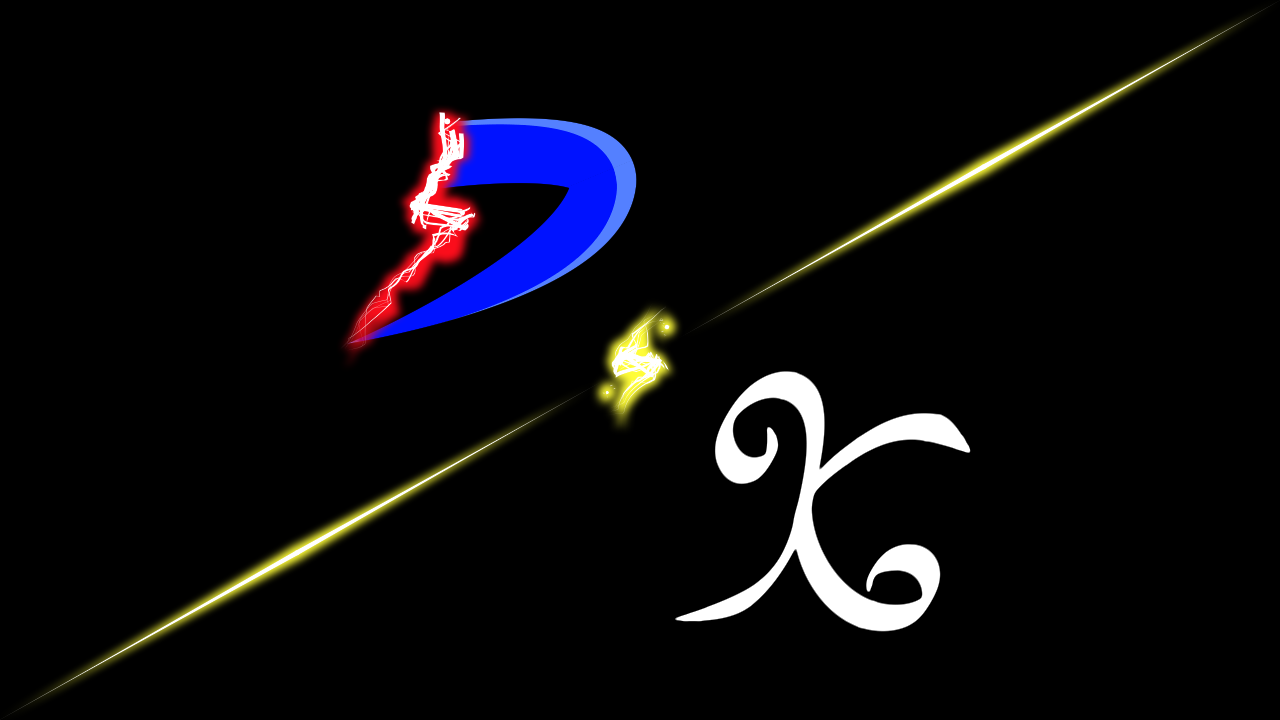
D&K Logo

My personal logo that I use for my profile picture and YouTube channel. I wanted something to both sign my work and be an easy to remember name.

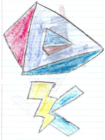
My initials are D-A-K, so I started there. The "A" was the easiest because it was in the middle, so it was obvious to choose the word “and” Then I started to this think about what I wanted the "D" to be. I liked the word “Destruction”, but I was wanting the "K" to be the word “Kaos” (chaos) but destruction and kaos seemed too redundant. The original sketches I made of the K had it with a lightning bolt too.

I remembered a quote “it’s easier to destroy than to create” this got me thinking about the animation process being about creating new things, so I settled on the word “Kreation” (creation) because it alluded to the destruction not being the end but a new beginning. Note: The "&" lightning bolt was altered because it didn't render right in the gif.

The evolution of my logo
These are the early designs for my current logo and how it progressed over the years.
2013: I wanted to make a logo using one or both of my initials. Growing up I was a fan of supper heros, wizards, or creatures with lightning powers. So I wanted one of them to have a lighting bolt as a main part of it.

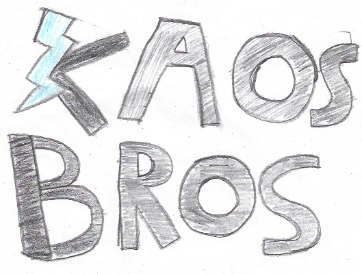
2013: I dropped the D originally because I wanted my brother to be part of my work. I started with the name Kaos (chaos) because I liked the idea of the unpredictability of it, and the Bros because we're brothers. I changed the K and B black to try and make them stand out more. The Blue represented my favorite color at that time, and the red was a reference to the Mario Bros.

2013: I wasn't loving the colors of my logo so I reimagined it in the Tron font using the programs discs as the O in bros but keeping the lightning in on the K. This got me thinking about making the logo having the same color consistently so it would be less distracting for the lightning on the K.
2013: Pulling the inspiration from the Tron design of my logo I inverted the neon blue letters to black and made the lightning the light blue to try and help draw in attention. I still wasn't sure about this logo though and I didn't know what to do with it.
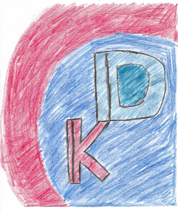
2013: An early concept to a logo using my initials. This is where the idea of have the modern logo at an angle over the K came from.

2014: I pulled some inspiration from the Danny Phantom logo and tried adding some rough ends to the D. Like it was suddenly cut off from something, by the lightning.
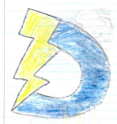
2014: I got rid of the ends and made the lightning bolt the cut off.
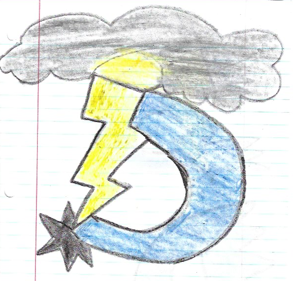
2014: I thought I would be cool to have the lightning originating from a source, but this made the logo have too much going on.
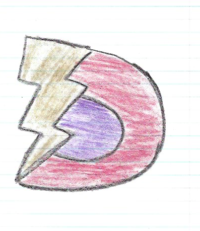
2014: I felt the yellow and blue in the D were to forgettable. So I tried making the lightning gold and the curve red with purple as a dark shade in the center. This was scrapped pretty quickly.

2015: I Wasn't loving the blue and yellow D so I made a few alts to it. I didn't decide at the time, but the red lightning idea came from this sketch.

2016: Some sketches I did to see how I wanted my logo to be oriented. I made the lightning bolt have only one jolt to it rather than two which was my original design. I settled on a cursive K to add order and elegance to the chaotic and cartoony D.

2016: One of my earliest attempts at using graphic design software. This is was my sort of rough sketch I made for a personal logo.

2017: A few months of practice and I returned to my logo to try and give it an updated look. I added highlights, glowing effects, and better curves to the "K".
2017: I felt that the logo was to bland and empty, so I added neon rods and a light casting on the background to brighten it up a bit.

2018: I tweaked the "K" a little, added a glow to the red lightning bolt and neon rods, and changed the highlight on the "D" to a softer highlight.

2020: The lightning bolts black outline was changed too white to help it stand out more. The "K" had it's swirl expanded, the ends were slightly adjusted, and the "K" was given a soft gray outline.

2022: I wanted to make the lightning more exciting and prominent in the logo. I knew this was over kill but I wanted to see how the whole logo would look when it had lightning making it up. The glowing effects were removed and the "D" got a hollow curve instead of its solid one. The "K" was given a makeover too.

2022: I attempted to get the logo a little back to its roots and made the "D" and "K" solid objects and filled in the lightning, but kept the lightning outline as the electricity. I changed the "K"'s lines to a pen style brush to give it a hand written look.
2022: Finally I settled on a smaller, more realistic looking lightning bolt for the "D". A highlight on the "D"'s curve to brighten it up. The neon rods came back but the "&" remained a bolt, and the "K" was made thicker and smaller so it didn't tower over the "D" in size.
The Illamanati
plus other llama stuff I made.

One I made for my brother's bachelor party as a logo for me and his friends (we all wore llama masks and surprised him). The idea of the design was to be remnant of a secret society, distinguished, and absurd, while keeping a llama as the main focus.

A redesign of the green one to keep similar elements of the original but while looking more like a secret agency rather than a distinguished gentleman. Hence the fedora being a slight nod to Perry the Platypus and the agency he works for (O.W.C.A.) and adding in a little darker colors to make it harder to see the llama. Like he was trying to hide in plain sight, to better go with the text (We Bleet In Plain Sight).

this one is for if I ever wanted to make a brand logo in the corner of a paper or something of the sort. Because the dark red one is very hard to see when it’s small.
The llama dance
This is a video I made for a DVD screen for my brother and his wife.
The Aztec art llamas are dancing in a circle around a beating Aztec art heart while Aztec lotuses go around with them. The background has an occasional square snake like strip slither by the top, bottom, and side while the video plays. There are also gear like art works in the background that turn.
The song is from Milo Murphy’s Law, episode: The llama incident
Llama mugs
Inspired by, The Emperors New Groove
A mug I designed for me, my brother and sister. I’m a big fan of ”The Emperors New Groove” and wanted to get them a funny present. I designed this and ordered it on mugs.

The llama graphic was easy enough to make using reference art from the movie, and the skull is just the bottom half of the llama with a weird top to make it look skull like.

The skull graphic wasn't too hard. I used the bottom half of the llama (like in the movie) and made the top half go over it. Then just cropped out the llama head and neck.

The one thing I didn’t notice until I got the mugs was that the font I used for the text didn’t have commas, so the "S" in "He's" is just floating there by itself.

The Text was something I played with for a while. I originally tried to get a different color text to go across the graphics, but they never looked right so I tried masking the words over the graphic as black and they turned out better then I could have hoped.
Llama Orb
This was a gift I special ordered my brother and his wife.


